Some say you play only as well as you look, with the guernsey in footy serving as a pillar of the game's heritage and tradition. That's not to say some have definitely gone through some modern re-designs and changes to get where we are now.
Though some clubs have upheld tradition by keeping theirs mostly the same throughout the decades, this is respectable, but it still won't earn them any fashion points in climbing up the list.
Here I'm looking for what stands out in creativity, how the colours mix and just personally how I view them.
11Geelong Cats
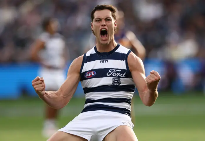
One of the cleaner looks for a stripped guernsey, all the logos are neatly aligned with the stripes, while the Ford logo blends well with the prominent use of white. It's simple but effective, and is one of the few teams with a heritage logo instead of just the cat face.