Some say you play only as well as you look, with the guernsey in footy serving as a pillar of the game's heritage and tradition. That's not to say some have definitely gone through some modern re-designs and changes to get where we are now.
Though some clubs have upheld tradition by keeping theirs mostly the same throughout the decades, this is respectable, but it still won't earn them any fashion points in climbing up the list.
Here I'm looking for what stands out in creativity, how the colours mix and just personally how I view them.
10Port Adelaide Power
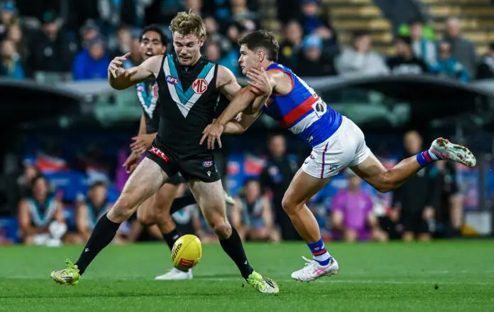
caught by w19during the round nine AFL match between Port Adelaide Power and Western Bulldogs at Adelaide Oval, on May 08, 2026, in Adelaide, Australia. (Photo by Mark Brake/Getty Images)
Some hate the teal, but it's got to be one of my favourites in how it's unique and immediately catches your attention by standing out amongst the black and white. Sleek and stealthy, the only hindrance is the red MG logo and it's not even that bad, matching well with the AFL logo.