Some say you play only as well as you look, with the guernsey in footy serving as a pillar of the game's heritage and tradition. That's not to say some have definitely gone through some modern re-designs and changes to get where we are now.
Though some clubs have upheld tradition by keeping theirs mostly the same throughout the decades, this is respectable, but it still won't earn them any fashion points in climbing up the list.
Here I'm looking for what stands out in creativity, how the colours mix and just personally how I view them.
3Melbourne Demons
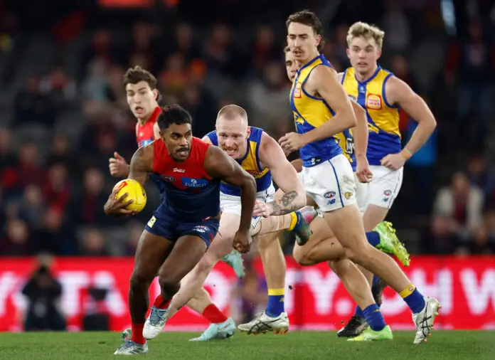
A blue that is just dark enough to mesh well with the upper red coming downwards through the chest. This is one of Melbourne's best and all the additional logos blend perfectly with the colour scheme to make an intimidating kit.