Some say you play only as well as you look, with the guernsey in footy serving as a pillar of the game's heritage and tradition. That's not to say some have definitely gone through some modern re-designs and changes to get where we are now.
Though some clubs have upheld tradition by keeping theirs mostly the same throughout the decades, this is respectable, but it still won't earn them any fashion points in climbing up the list.
Here I'm looking for what stands out in creativity, how the colours mix and just personally how I view them.
13Carlton Blues
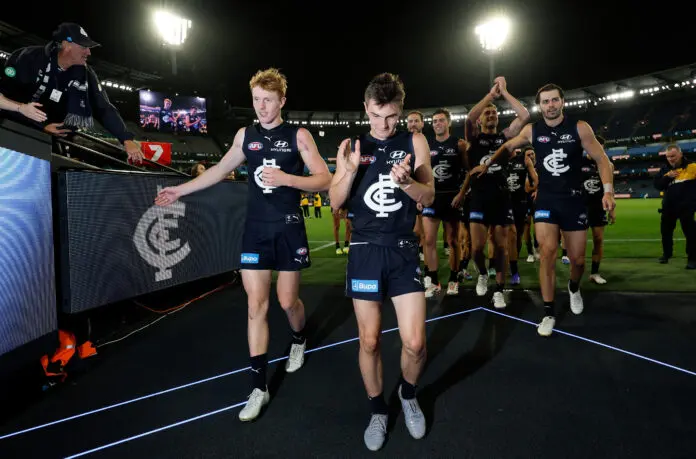
Probably the most controversial on the list, but it really shouldn't be. I'm sorry Carlton fans, but as iconic and old as it is, it's just the logo slapped on a navy-blue base. At least, the logo is a different colour and the navy blue is iconic, even inspiring the Victorian Origin team.