Some say you play only as well as you look, with the guernsey in footy serving as a pillar of the game's heritage and tradition. That's not to say some have definitely gone through some modern re-designs and changes to get where we are now.
Though some clubs have upheld tradition by keeping theirs mostly the same throughout the decades, this is respectable, but it still won't earn them any fashion points in climbing up the list.
Here I'm looking for what stands out in creativity, how the colours mix and just personally how I view them.
17Gold Coast Suns
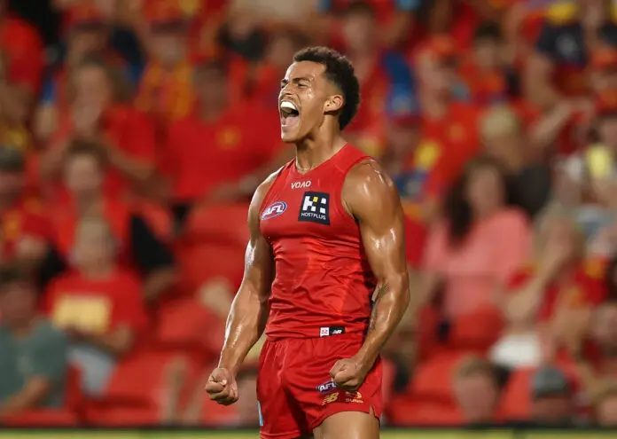
It should come as no surprise that this red slop of a design finishes towards the bottom of the list. All Red and no yellow, with no pattern or hardly a visible team logo, makes it one of the laziest attempts at a rebrand I've ever laid eyes on.