Some say you play only as well as you look, with the guernsey in footy serving as a pillar of the game's heritage and tradition. That's not to say some have definitely gone through some modern re-designs and changes to get where we are now.
Though some clubs have upheld tradition by keeping theirs mostly the same throughout the decades, this is respectable, but it still won't earn them any fashion points in climbing up the list.
Here I'm looking for what stands out in creativity, how the colours mix and just personally how I view them.
8Essendon Bombers
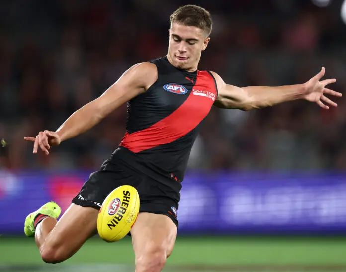
Red and black is a very complementary colour mix to get wrong, and with just the dash across the black, there's not much more else needed to make this striking, with the sponsor logo not taking too much away by not being an ugly colour.